Color customizations settings
You can customize the colors for elements in your online store's sections, blocks, and general settings with color input fields. The color input fields available in your theme depend on how colors are managed by your theme. Colors are managed through either of the following color systems:
- Color palettes are available in newer themes such as Horizon 4.0.0 and later. A color palette is a set of named brand colors that applies across your entire theme. Sections and blocks might have a color input field that you can use to override the palette color with a custom color, or change the assigned palette color.
- Color schemes are available in most themes, such as all free Shopify themes before the release of Horizon 4.0.0. A color scheme is a group of different colors, such as background, text, and button, that you then apply to different sections throughout your online store. You can create multiple colors schemes in your theme settings.
You can also apply colors with CSS in the Custom CSS section of the Theme settings page of the theme editor, or by using the theme code editor instead. Learn more about adding CSS in your theme settings, or in the theme code editor.
Considerations for customizing colors in the theme editor
Review the following considerations for customizing colors in the theme editor:
- The type of color input fields available on your theme depend on the your theme's source and version. Learn more about theme versions.
- The elements of your site that you can customize depend on the settings available in your theme.
- Templates don't have individual color input fields. This ensures that your online store design is consistent throughout your online store. A template is considered a main page or the main content for a store. Having different colors throughout your store might lead to bad user experience and can cause customers to leave your store without purchasing products.
Color schemes
A color scheme is a group of color input fields for different elements, such as backgrounds, text, and borders, that you can apply to different parts of your online store. The color scheme automatically applies the relevant colors from the scheme to matching elements in the section or setting.

Create and manage your color schemes in the Theme settings section of the theme editor, and then use a Color scheme setting apply a scheme to compatible areas of your online store. You can have up to 21 color schemes.
Learn more about managing color schemes in the Theme settings section of your theme editor.
Example of a color scheme
For example, in the Colors section of the Theme settings page of the theme editor, you add a color scheme named Scheme 2 with the following color input fields:
- Set the Background setting to the color pink.
- Set the Links setting to the color dark red.
- Set the Text setting set to the color black.

In a Rich text section on your homepage, in the Appearance section, you select Scheme 2 in Color scheme input field. The Rich text section's background changes to pink, the text changes to black, and the links change to dark red.

Color palettes
If your theme uses color palettes, then you can create a color palette as a quick way to reuse colors across multiple settings in the theme editor, and assign palette colors to elements in your online store. When you change a color from the color palette, all settings that use that color dynamically update to the new color. This means that you don't need to remember hexadecimal codes when you want to use a color more than one time.

Your theme's developer chooses which colors to include in the palette, such as primary, secondary, and accent colors. When you change a palette color, the update propagates to every section and block that uses it. You can't add palette colors to elements where they're not included by the theme developer, except if you customize your theme.
Colors in your color palette that are automatically assigned to elements of your theme might not have a corresponding input field in the theme editor to remove or reassign that color. For example, the primary color of your palette might be assigned to all page background colors. Some sections, such as your theme's header, or footer, might have a background color input field that you can use to override that section's background color, but no setting for the overall page background color. Navigate to different pages of your theme to determine which areas of your theme have a palette color automatically assigned with or without override settings.
You can also override palette colors by assigning a unique color to any available color input fields. These overrides let you customize a single area without changing your overall brand colors.
You can add new colors to your theme's palette in the color picker, and manage colors from the Colors section of the Theme settings page of the theme editor. Learn more about managing color palettes in your theme settings.
Override a color on a section or block
Some sections and blocks include color input fields which you can use change the color of a specific element. You can change the color to a different color in your palette, or to a unique color. When you set a color override, it takes priority over the palette color for that section or block. For example, you can assign a color in your color palette to the Background color setting in your theme's Footer section.
Steps:
From your Shopify admin, go to Online Store.
Next to the theme that you want to edit, click Edit theme.
In the theme editor, click the section or block that you want to customize.
Click the available color input field setting.
Choose a color from the palette swatches, or enter a custom hex color code.
Click Save.
Color input field types
The following types of input fields in the theme editor accept a color value:
- Use the Color input field to assign a solid color with either the color picker, or a dynamic color resource from your Shopify admin.
- Use the Color scheme input field in sections and general theme settings to assign a color scheme to that element.
- Use the Background gradient input field to assign a gradient with the gradient picker.
The color input fields available on your theme depend on your theme's version, setting, and developer.
Select a color with the color picker
You can use the color picker to assign an individual color. In the color picker, you can select a color in any of the following ways:
- Use the color slider to change the hue of available colors in the picker preview.
- Use the hexadecimal field to enter a code for a particular color, such as
#0000FFfor a standard, pure blue. - Use color names such as
red,black, orblue. - Use RGB color codes.
- Use
 to pick a specific color using your cursor from anywhere on your screen.
 - Use
 to narrow the number of available colors in the picker preview to 40.
 - If your theme uses color palettes, select a color from the Color palette section.
- If you've manually selected any colors previously during the session in the theme editor, then you can also select from your Recently used color swatches.
Connect a color resource
The color input field accepts a dynamic resource that you can use instead of the color picker. You can connect a dynamic source from either of the following sources in your Shopify admin:
- Connect your brand colors in the Colors section of the Settings > General > Brand page.
- Connect a metaobject with the Color type metaobject definitions in the Settings > Metafields and metaobjects page.
Learn more about adding brand colors in your Shopify admin and connecting and displaying metaobjects in the theme editor.
Steps:
From your Shopify admin, go to Online Store.
Next to the theme that you want to edit, click Edit theme.
Optional: To customize a template other than the Home page, select the template that you want to customize from the template menu in the menu bar.
Click the color input field that you want to add the color to.
Click the
 button next to the input field.
Select a metaobject or metaobject reference from either the Metaobjects or Brand source.
Click Save.
Gradients
If your theme has a Background gradient input field, then you can a gradient to a background element in some areas of your theme. If the gradient can't be applied, then the Background color setting applies instead.

The gradient picker allows you to select the colors, gradient style, angle, position, and opacity of the gradient. The options selected in the gradient picker are previewed in real time in the theme editor.
You can also create a gradient background using CSS code in the theme code editor, which includes a validation checker. Learn more about adding CSS in your theme settings, or in the theme code editor.
Set up gradients
From your Shopify admin, go to Online Store.
Next to the theme that you want to edit, click Edit theme.
Click the
 icon, and then click Colors.
In the Schemes section, click an existing scheme that you want to edit.
Click the gradient color swatch option, such as Background gradient.
The first time you set up a gradient, some preset options are displayed for you to choose from. Select any preset gradient to open the options panel.
Select your gradient options:
- Choose between a linear or radial gradient. Use the buttons to select your preferred gradient style.
- Set the angle of your gradient with the up and down arrows. Click the up or down arrow to increase or decrease the angle percentage by 5.
- Use the slider to select the Position of your gradient, or enter a numeric value in the field.
- Enter a specific color hex code or use the color slider to choose a hue. Recently selected colors are displayed at the bottom of the gradient options panel.
- To make your gradient opaque, use the slider on the right to select the transparency of your gradient. You can also enter a percentage in the field next to the hex color code.
- Click Save.
Use CSS to set gradients
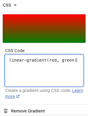
Most CSS background property values can be used to set a background color. You can use this field for solid colors (for example, #000000, black, rgb(0,0,0), rgba(0,0,0,0), hsl(0, 0%, 0%), and hsla(0, 0%, 0%, 1) all produce a solid black background), or for gradients (for example, linear-gradient(red, green), radial-gradient(red, green), or conic-gradient(red, green)). Gradients can also be repeated.
Steps:
From your Shopify admin, go to Online Store.
Next to the theme that you want to edit, click Edit theme.
Click the
icon, and then click Colors.In the Schemes section, click an existing scheme that you want to edit.
Click the gradient that you want to edit.
Click the arrow next to Gradient, and then select CSS.
In the CSS code field, type or paste your gradient code. The theme editor preview displays your gradient in the appropriate location.
Click Save.
Remove a gradient
From your Shopify admin, go to Online Store.
Next to the theme that you want to edit, click Edit theme.
Click the
icon, and then click Colors.In the Schemes section, click an existing scheme that you want to edit.
Click the gradient that you want to remove.
Click Remove gradient.
Click Save.